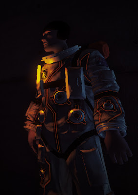
Main Character
 I've made some good progress on the main character but there's still a fair bit to do. I'd say the model is mostly done but the texture still needs work. Areas like the straps, hands and head haven't really been worked on yet so the texture you see here is pretty much a test run.
Still, I like where it's headed and it's been great to get a more complex model in to replace the robot I'd previously been using.
 |
Fun with deferred light types
I'd always planned for the character to wear some sort of light source and for lots of reasons but primarily it just looks cool. It's hard to think of a sci-fi film where the suits don't have some sort of moody light source (often blue) located just under the actors jawline so I wasn't about to buck the tradition :)
I wanted the light source to realistically illuminate both the character and the environment but it was hard to get both those properties without resorting to shadow maps. I thought I'd approach it slightly differently so I ended up using a single light source with two falloff factors (left). An omni directional, short range falloff provides local lighting to the character without affecting areas it shouldn't (like the opposite side of the body) whilst a hemispherical , medium range falloff illuminates the nearby environment.
Post Process Colour Correction
This has been on my list of things to try out for quite a while now so it was great to finally get it implemented. There aren't many resources on how this should be done but I think that's mostly due to it being quite a straightforward process. Using a pixels RGB value as a texture coordinate you simply sample a 3D texture containing the colour correction information. The image shows a few examples.
This opens up a massive range of colour correction options and any number of software packages can be used to create the 3D look up textures, often referred to as LUTs. The process is largely the same regardless of the software used and involves colour shifting both a reference image (usually an uncorrected screenshot of the game) and a flattened version of the LUT. The altered LUT is then sampled at runtime, reproducing the colour alterations made to the reference image. Below you can see how the sequence looked before and after colour correction with the flattened LUTs as overlays.
That's all folks
To wrap up I thought I'd post some un-textured shots of the scene as they always do a good job of showing off the lighting volumes.


6 comments:
That's an intriguing custom light type. Would you be opposed to sharing the shader code you used to get that custom falloff?
I thought about posting the code but it's pretty straight forward. It's really just two omni lights only the larger omni uses
saturate(dot(lightForwardDir,lightToSurfaceDir))
to clamp it's effect to the hemisphere in front of the character / light source.
But wouldn't that make it really bright where the two overlap? Are you using any sort of blending scheme (ex. min or max) where they overlap?
It certainly gets brighter but in practice it isn't really an issue. The doubling effect isn't really noticeable on the character and he has to stand pretty close to an object for it to become apparent.
Have you tried taking the max of the two, and seeing if it looks better?
That hadn't occurred to me but I'll give it a shot, I think it should work well. Thanks for the suggestion :)
Post a Comment