Pages

Monday, 29 August 2011

Rust animation test

Haven't had much free time the last few months but I did manage to let this rendered animation test grow slightly out of control. Big thanks to Stephan Schutze (www.stephanschutze.com, Twitter: @stephanschutze) for the awesome audio work.


Concept and design work


This little guy started out as a bunch of thumbnail sketches (below left) well over a year ago, but the design also shares some similarities with an even older concept (below right).


Eventually I got around to modelling and although the concepts don't really show it, I drew a lot of inspiration from the Apple IIe and Amiga 500 computers of my misspent youth. The 3D paint-over below shows an early version with only one antennae. The final version has a second antennae which was an accident, I kept it when I realised they could work almost like ears and added a bit more personality.


And finally, a snippet from an old mock comic book panel, just for the hell of it :)

Tuesday, 31 May 2011

Light volume sampling again

Recently I've been taking another look into how I render light volumes, I don't get nearly as much time as I'd like to work on this stuff these days but I've hit upon some improvements so I thought I'd write it up. 

The two primary issues I've come across with light volumes are light leaks and ensuring that the light volumes are padded so as to avoid issues with linear sampling. This post goes into a bit more detail about the issues I encountered and provides a bit more background to this post.

In a nutshell though, sampling a 3D scene at sparse regular intervals doesn't tend to yield very good results. Frequently the scene is sampled from behind geometry, causing light leaks and other issues.

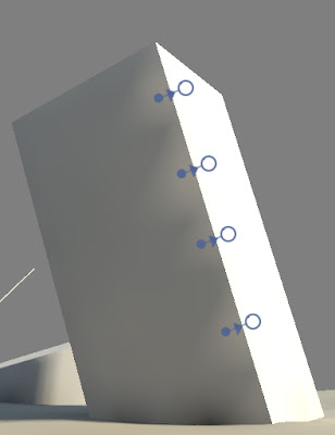
My previous solution used a bunch of raycasts to determine the best new location for each sample point whenever there was scene geometry close by. Whilst this was an improvement it wasn't always effective and often required extra geometry to prevent light leaks. Another common problem occurred around hard geometry corners, with the new sample point often ending up on one side of a corner when really it needs to sample both sides. This tended to look quite bad in situations where the lighting differs substantially on either side of the geometry edge. The image below hopefully makes the problem clearer.

Problem: In this case the issue shows up as a sawtooth pattern on the darker side of the object.

Cause: The sample point can only be in one place at a time?

A solution: Split the sample point

A solution to this problem is to just split the sample point in cases like this. Because the lighting is evaluated and stored as the average amount of incoming light from six basic directions (+X,+Y,+Z,-X,-Y,-Z), we can separate the sample locations for each of these base vectors. If the light volume texel contains geometry then each sample direction moves to the closest face with the most similar geometry normal. If no similar normal is found then the sample points simply move to the closest face, regardless of it's geometry normal.


So this works pretty good but we're still left with the problem of linear sampling causing further light leaks. In other words, samples that don't contain geometry can still contribute their lighting information.

Previously I'd just use a very wide search radius for each sample, enough to take this effect into account, but this caused further problems as it wasn't always easy to predict where a sample would end up. To solve this I've implemented a post render padding stage, very similar to how light maps are padded, only in 3 dimensions. The padding process looks for texels that contain no geometry but that have neighbours which do. These "empty" texels are then set to contain the average lighting value of all there geometry containing neighbours. This has the effect of padding the light volume and removing the remaining light leaks.

Stepping through these issues and solutions using a simple scene we have:

A) No Fixes. 

No attempt to fix the sample locations or pad the light volume. Light leaks are a big problem here.

B) Sample points fixed. 

Fixing the sample locations certainly improves things, the point sampled version barely displays any light leaks but we still hit problems when using linear filtering.

C) Sample points fixed and volume padded. 

Finally, padding the light volume solves the remaining light leak issues and smooths the overall result.

That example scene was pretty simple so there are some examples of more complex scenes below. Click for larger versions.




Sunday, 15 May 2011

Sunday Scribble

I'll hopefully have another post on lighting volumes soon but till then, a scribble!

Wednesday, 6 April 2011

FXAA part 2

Some tests with the higher quality FXAA shader which you can read about here. These are mostly old screenshots that have been processed with the shader running in RenderMonkey. The console version I used in the previous post is good but this version is really working some magic :) Many thanks to Timothy at NVIDIA for making it available.


And some full screen examples...


Monday, 4 April 2011

FXAA

I'm getting some good results with the FXAA shader code that was recently posted by Timothy Lottes so I thought I'd post the results. These pics are taken from RenderMonkey, using screen shots from the render engine I'm working on.


The post process sharpening filter I'm using in the last two examples seems to lead to images that look a little too soft by comparison. I might need to rethink how / when I apply the sharpen filter, doing it before applying FXAA probably isn't the best idea :)

Here are some full screen examples, the museum examples are the same ones seen in this post.

(Click for hi res versions)


Saturday, 2 April 2011

Old depth of field tests

I don't have much spare time these days so I'm raiding the vault for this post :)  These are some old post process depth of field tests I did ages back. It's quite an expensive method so I've held off implementing it in the engine so far. I rendered the source colour and depth images in Mental Ray and used Render Monkey for these tests. The images below show the effect of  moving the focal plane through the scene.

(click for hi res versions)


The source images: A linear space colour image and scene depth, both 16 bit.


Sunday, 27 February 2011

Crash site - test shots

I've been working on matching the look of an earlier concept piece and these look development renders so I thought I'd post some results. I've added some basic fog to the static and skinned model shaders but apart from that the engine is unchanged. The colour correction system is doing most of the work in these shots and it's a lot of fun to work with. I think I've matched the overall look and I'm happy with the monoliths but the crashed pod isn't really working for me yet.


White diffuse lighting shots...


... and some alternate colour grading look tests. It's far too easy to get carried away and this was one of the tamer efforts :)

Sunday, 6 February 2011

Transparency experiments

I've been experimenting with transparency in the deferred engine I'm working on so I thought I'd share some tests. The alien model I used in these tests is the work of Leigh Bamforth and you can grab it here. The original model looks a lot cooler, I'm using a greatly simplified version here.

To begin with, all opaque geometry is drawn as usual. Looks a little weird but it's going somewhere :)


After this the first layer of transparency is drawn. This phase essentially uses the same technique as soft particles. An alpha value is calculated by comparing the depth in the existing frame buffer with the depth of the volume surface being rendered. This is calculated as follows

fade = saturate((scene_depth – surface_depth) * scale);

The surface takes it's colour by sampling the lighting volume at the surface position, along the view direction. This gives the effect of light scattering through the volume and can be seen below, with the light from the thin vertical windows illuminating the volume.


The final transparency stage adds a glass like surface layer and is much simpler. This shader is fairly straightforward as it only has to lookup a reflection map and calculate a fresnel term. The fresnel term is used to control the strength of the cubemap reflections and as an alpha value.


I've captured a video although the quality isn't the greatest. Apologies for the ever present cursor as well, I forgot to disable it before recording the clips in FRAPS.


A few more examples showing different volume colours and densities.


Et voila, lighting volumes now support pickled aliens in glass jars.